
Spotify Redesign
Spotify is a leading digital streaming service that houses millions of songs and podcasts from many different creators and artists around the globe. With its vast library of content, Spotify allows its users to listen to anything anywhere.
Role
UX Project Lead (Onboarding)
Tools
Figma, Figjam
Timeline
Sept. - Dec. 2023 (11 weeks)
Team
Sarah, Jade, Abby, Samantha
What Exactly Was the Problem?
Despite connecting its users to millions of songs and podcasts, the Spotify mobile app falls short in delivering personalized recommendations. They also fail to integrate existing social features, diminishing the overall user experience.
What Was Our Solution?
We implemented features that would help curate more accurate and personalized recommendations. Additionally, we focused on bridging the gap between the desktop and mobile experience, which allowed us to foster greater social connection without turning Spotify into another social media app.
Research
So, How Did We Get There?
My team and I started our process by looking at Spotify’s competitors, including Apple Music, Amazon Music, Tidal, Pandora, YouTube Music, and SoundCloud. We found that, aside from Spotify and SoundCloud, most apps lacked social features, offering no way for users to interact. Additionally, Spotify and Amazon Music underperformed in music discovery, with users relying more on their own playlists. While each app had strengths, all had areas for improvement, particularly in sociability and discovery.

Understanding Our Users
After comparing competitors, we conducted 12 interviews asking current Spotify users about their experiences. We focused on questions regarding their experiences with music discovery, the social aspects of Spotify, and Spotify in comparison to competitors. From here, we clustered our information using affinity mapping.

Ideate
Niche Nancy’s & Fatherly Fredrick’s Troubles
To bring our insights to life, we developed user personas that represent the diverse experiences and needs of Spotify's users. Each persona embodies key characteristics and behaviors derived from our research, helping us to empathize with users and guide our design decisions. Alongside this, we mapped out their journeys and identified possible issues they may encounter. This process allowed us to come up with opportunities for improvement through ‘how might we’ questions.


Organizing the Experience
Once we had a better understanding of our users’ needs and frustrations, we mapped out the information architecture. While we kept the existing organization of the app, we introduced a new profile tab to the navigation bar to make profiles more accessible and address pain points related to the social experience on Spotify. This change provided a solid foundation for the rest of the design process.

Design
Sketching Out Basic Ideas
With all our research in hand, we began the design phase by creating low-fidelity sketches. Each team member focused on two parts of the navigation bar and drafted multiple ideas. This collaborative process allowed us to mix and match our concepts, leading to discussions about our thought processes and helping us identify key features that effectively addressed our insights.
Home

Search

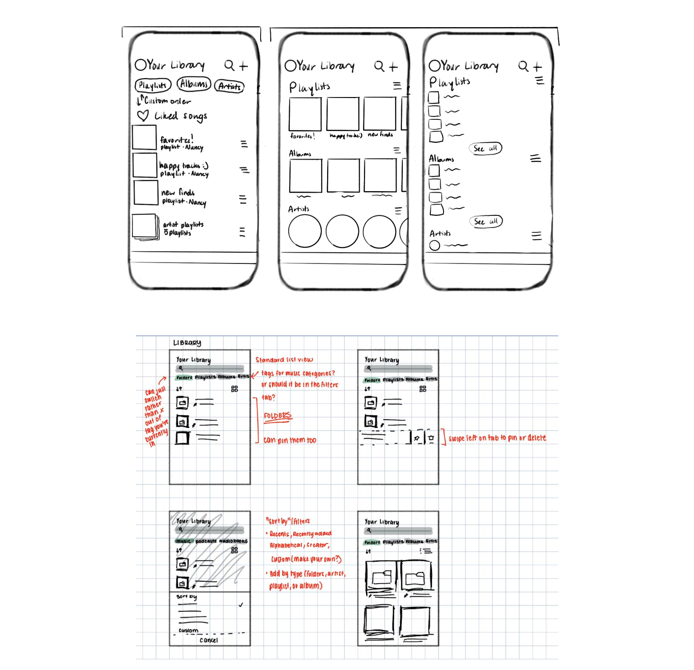
Library
Profile

Bringing Our Sketches to Life
Building on our sketches, we developed mid-fidelity screens that further refined our design concepts. We used this time to combine ideas and create our own. Also, we continually provided feedback to one another during this process. Below are some of the mid-fidelity screens we created.


Testing Our Ideas
Before moving onto the high-fidelity phase, we conducted a round of user testing with 8 users. Through our user tests, we found that users appreciated the new features we added, such as the addition of the profile to the navigation bar and friend activity from the desktop version. Similarly, we found that users struggled with small touch targets and an overwhelming amount of information on the profile page.
Final Mockups
Onboarding
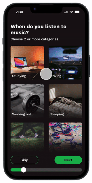
During the onboarding experience, users are able to input when they listen to music, what genres they are interested in, and what artists they listen to. If the user listens to podcasts as well, the same questions will be asked. This provides more personalized and accurate recommendations.
Home
The home page has been designed to provide recommendations to the user, allowing users to discover new songs and podcasts. Importantly, the friend activity feature from the desktop site has been brought over to mobile, fixing the gap from desktop and mobile.

Search
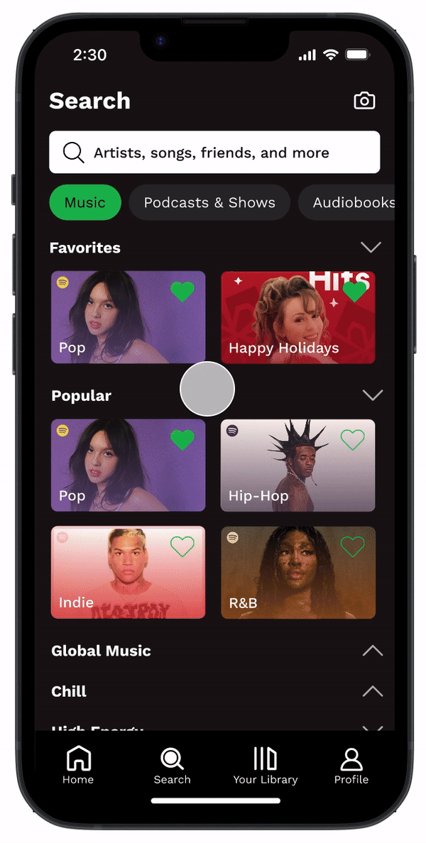
The search page has been reorganized into sections of search categories. These sections can be expanded or collapsed, providing a less overwhelming view to the user. Alongside this, users can now favorite search categories, bringing them to the top of the page to save time on scrolling.
Library
Within the library, users can organize their playlists using playlist folders, a feature only available on the desktop version. Users can also filter their playlists depending on their mood, as we found that most users gravitate towards their own playlists when listening to music.

Profile
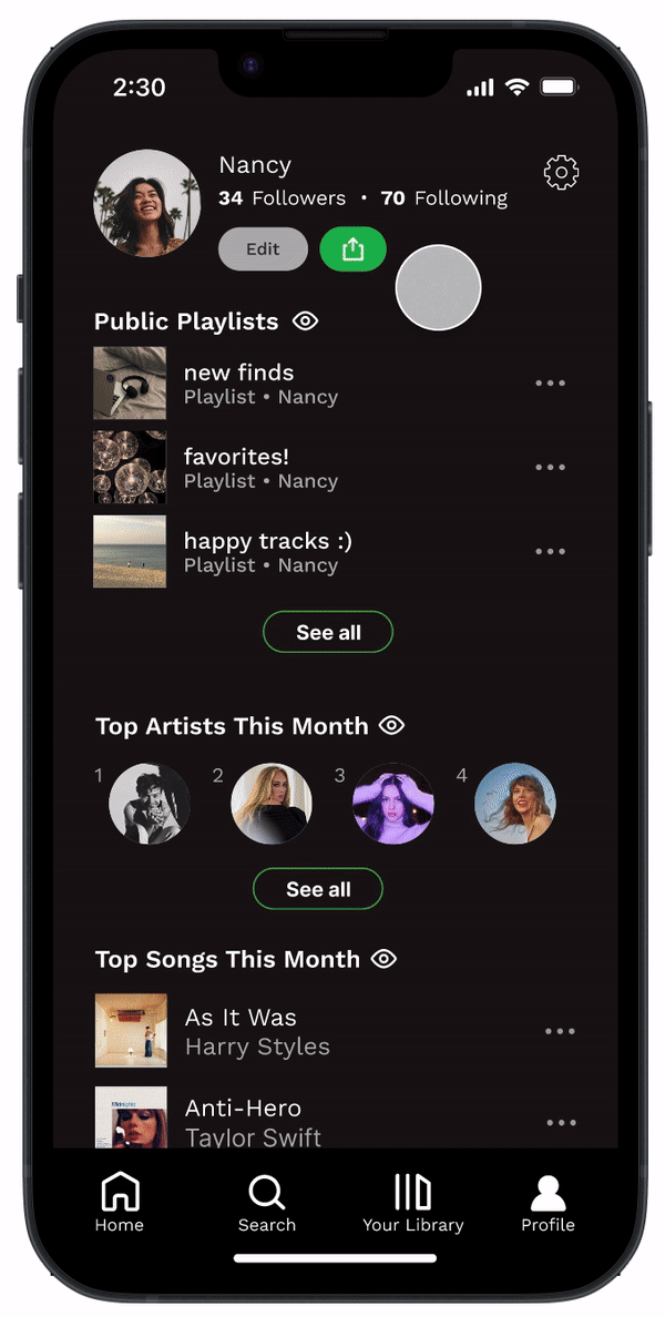
Through the profile, users are able to hide/show their stats of the month, allowing them free control of what they want to share. Additionally, users are able to view their followers and following, something that does not entirely work on Spotify.
Growth
What’s Next?
If we were given more time to work on this project, our team would like to conduct a second round of user testing with our high-fidelity prototypes. This would ensure the changes we made from our first round were implemented correctly and are desired by users.
Personal Reflections
First time leading a project
This was the first UX project that I led. At the beginning of this project, I was very unsure about my leadership skills and if I was in the right position leading a project on my own for the first time. However, as the semester progressed, I learned to become more confident in my abilities. I was able to gain a stronger sense of direction which helped me as our project started to ramp up. In the end, I learned a lot of valuable lessons, both from myself and my wonderful team.
A little goes a long way
With this project, I learned that not every redesign is going to have large, crazy new features that will better the user experience. Sometimes changing the layout or adding smaller features is all that is needed to make an application more user friendly. In the end, the app still felt like Spotify, just with some adjustments.
Questions?
If you have any questions or comments about this project, feel free to contact me either via email (ahuki2@illinois.edu) or LinkedIn.